Skinning the UIPopoverController
The UIPopoverController was introduced in iOS 3.2 as part of the initial iPad release. An exclusive to the iPhone’s big brother, it’s seen a lot of action. Needless to say, if you’re reading this tutorial, you’ve probably already used the UIPopoverController dozens of times! But, have you ever needed to change its appearance?
In this tutorial, I’ll show you how.
Skinning the Popover
The standard look of a UIPopoverController has always been a nice one, and for a long time it’s the only one you’d see because there was no way to change it. If you wanted it to have a different appearance, you were forced to write your own! Thankfully, when iOS 5 made landfall, the -popoverBackgroundViewClass property was introduced and you could finally, natively, skin the popover any way you liked!
Unfortunately, the interface can be somewhat confusing and demand a lot of logic from a developer. Let’s walk through a custom skin and explain how to get it to work. The source code for this tutorial is here.
Step 1: Create the Assets
You need to create two assets for a popover skin: the background image and the arrow image. These are straightforward once you see an example. Let’s look at the “orange theme” we’ll be implementing:
Pretty simple, right? You can go with as complex a design as you’d like, however, it doesn’t really get any more complicated. Also, note the squared edges. We’ll actually round them in code, but know that you can also do it right in the graphics asset if you wanted to.
Step 2: Subclass UIPopoverBackgroundView
Your skin class must extend the abstract UIPopoverBackgroundView class. There’s a series of methods you’ll need to define, so let’s walk through each one and add them to our class.
Step 3: Implement +contentViewInsets
Imagine the background of your skin, minus the arrow. The content of your popover will use all of this space when presented to the user. The insets define the margins we use around it. This allows us to see the boundaries of the popover much like the default skin. Our skin will inset 10 points all around:
+ (UIEdgeInsets)contentViewInsets {
    return UIEdgeInsetsMake(10, 10, 10, 10);
}
Step 4: Implement +arrowBase and +arrowHeight
These two static methods merely define the size of your arrow. Putting it simply, you can just return the asset’s width and height dimensions. If you load the arrow image statically (in +initialize), you can just return the frame’s width and height. We’ll use constants:
+ (CGFloat)arrowBase {
    return 31.0;
}

+ (CGFloat)arrowHeight {
    return 70.0;
}
Note that the arrow image is rectangular. A square image is a little more forgiving if you get some of the layout math incorrect, but I wanted to demonstrate things with the rectangular arrow appearance.
Step 5: Implement +wantsDefaultContentAppearance
This property allows you to skip some pretty subtle effects Apple adds to the popover’s appearance. Change this value to see what your popup looks like in both modes.
+ (BOOL)wantsDefaultContentAppearance {
    return YES;
}
Step 6: Implement the arrowDirection property
These next two steps are just adding properties. The SDK will supply us with the arrow direction for our popover at some point before displaying it. It will be one of the four basic directions: up, down, left, or right. The user can specify the arrow to be in “any” direction as well, but that value will be calculated and the rest is what will be set here. Once iOS determines which direction it should use of the four, it sets this property. All you need to remember is to ask the view to re-layout itself after we set it.
- (void)setArrowDirection:(UIPopoverArrowDirection)arrowDirection {
    _arrowDirection = arrowDirection;
    [self setNeedsLayout];
}

- (UIPopoverArrowDirection)arrowDirection {
    return _arrowDirection;
}
Step 7: Implement the arrowOffset property
At first glance, arrowOffset is a mysterious value. What is it? Much of the time, the value will be 0.0, or no offset. What it’s used for is when you present a popover near the edge of the screen and, since the popover arrow normally wants to horizontally or vertically aligned with the point it’s presented from, has to adjust. Visually, this will mean the arrow will seem to “slide” along the bubble’s axises.
We save the value and use it later when we need to lay out the views.
- (void)setArrowOffset:(CGFloat)arrowOffset {
    _arrowOffset = arrowOffset;
    [self setNeedsLayout];
}

- (CGFloat)arrowOffset {
    return _arrowOffset;
}
Step 9: Initialize Our Skin
We’ll back up here for a second and properly initialize our skin for customization. This generally involves two things: instantiate the background and arrow image views. You’ll see that we also want to make sure the background image is properly resizable since we want to handle any size popup. (For our skin, it’s not necessary, but the code is presented anyway.) Another interesting thing we’ll do is round the corners of our popover similarly to the original. We could just have easily done this in the image as well, so if you prefer to do it like that, go for it.
- (id)initWithFrame:(CGRect)frame {
    if ((self = [super initWithFrame:frame])) {
        // background (for demo only, we don't actually need this for our background)
        UIImage *backgroundImage = [UIImage imageNamed:@"bubble-rect"];
        UIImage *resizableBackgroundImage = [backgroundImage resizableImageWithCapInsets:UIEdgeInsetsMake(40, 40, 40, 40) resizingMode:UIImageResizingModeStretch];

        _backgroundImageView = [[UIImageView alloc] initWithImage:resizableBackgroundImage];
        _backgroundImageView.contentMode = UIViewContentModeScaleToFill;

        // round those corners!
        _backgroundImageView.layer.cornerRadius = 15;
        _backgroundImageView.layer.masksToBounds = YES;

        // arrow
        UIImage *arrowImage = [UIImage imageNamed:@"bubble-triangle"];

        _arrowImageView = [[UIImageView alloc] initWithImage:arrowImage];

        // make sure the arrow is on top of the background
        [self addSubview:_backgroundImageView];
        [self addSubview:_arrowImageView];
    }

    return self;
}
Make sure the arrow’s z-order is above the background’s. You’ll find it’s always going to be easier to keep a clean seam where the two meet by doing it this way.
Step 10: Implement -layoutSubviews
Finally, with the formalities out of the way, here’s where we earn our bacon. We know the arrow size and all the properties of the popover. The system is ready to render it, and now here is where we have to properly size everything according to plan.
In the -layoutSubviews method, we’ll need to do the following:
- Rotate the arrow correctly.
- Position the arrow correctly.
- Size the background to accomodate the arrow’s position.
The math can get tricky here. This method is completely reusable if you’re wanting the standard popover behavior that we’ve all come to expect. Unless you’re doing something radically different, this is all you’ll need.
- (void)layoutSubviews {
    [super layoutSubviews];

    CGFloat arrowHeight = [self.class arrowHeight];

    CGRect backgroundFrame = self.frame;
    CGPoint arrowCenter = CGPointZero;
    CGFloat arrowTransformInRadians = 0;

    if (self.arrowDirection == UIPopoverArrowDirectionUp) {
        backgroundFrame.origin.y += arrowHeight;
        backgroundFrame.size.height -= arrowHeight;
        arrowTransformInRadians = 0;
        arrowCenter = CGPointMake(backgroundFrame.size.width * 0.5 + self.arrowOffset, arrowHeight * 0.5);
    } else if (self.arrowDirection == UIPopoverArrowDirectionDown) {
        backgroundFrame.size.height -= arrowHeight;
        arrowTransformInRadians = M_PI;
        arrowCenter = CGPointMake(backgroundFrame.size.width * 0.5 + self.arrowOffset, backgroundFrame.size.height + arrowHeight * 0.5);
    } else if (self.arrowDirection == UIPopoverArrowDirectionLeft) {
        backgroundFrame.origin.x += arrowHeight;
        backgroundFrame.size.width -= arrowHeight;
        arrowTransformInRadians = M_PI_2 * 3.0;
        arrowCenter = CGPointMake(arrowHeight * 0.5, backgroundFrame.size.height * 0.5 + self.arrowOffset);
    } else if (self.arrowDirection == UIPopoverArrowDirectionRight) {
        backgroundFrame.size.width -= arrowHeight;
        arrowTransformInRadians = M_PI_2;
        arrowCenter = CGPointMake(backgroundFrame.size.width + arrowHeight * 0.5, backgroundFrame.size.height * 0.5 + self.arrowOffset);
    }

    _backgroundImageView.frame = backgroundFrame;
    _arrowImageView.center = arrowCenter;
    _arrowImageView.transform = CGAffineTransformMakeRotation(arrowTransformInRadians);
}
Your frame of mind here should be that your popover has been pre-sized to a rectangle which includes the popover background and the space the arrow takes up. Based on the arrow position, you want to constrict the rectangle and then position your arrow image where it needs to be. If you simply accepted the pre-sized frame as is, you could make a popover with no arrow. I don’t recommend it, but you could.
As a personal preference, I like to render my arrow assets in the up direction and rotate as needed from there. Like I said, this is just personal. Whatever is easiest to visualize for you, just make sure you rotate it properly as we did here.
Another interesting point is that my code never uses the +arrowBase value. I’m sure the SDK does, so we still have to provide it, of course. But it’s not strictly necessary to render properly in our own code.
Conclusion
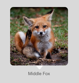
Here’s our themed popover!
Skinning a popover is not the most intuitive experience Apple has provided for its developers, but as you can see once you implement it correctly, you can re-use it again and again. I’m not sure why Apple made a generic skinning framework for this when the popover API itself seems to really enforce a narrow view of what a popover is. However, now that we have the power to customize our popovers, it’s good to know we can provide an algorithm pretty easily.
Asset Catalogs: Love Em or Leave Em? My Concise Introduction to CocoaPods
Comments are currently closed.
One thought on “Skinning the UIPopoverController”


 I've been writing mobile apps professionally for 10 years: Blackberry, Java, ME, iPhone, Android. I've gotten dozens of apps into the various App Stores for dozens of clients, big and small.
Thanks, just when I needed this :)